Reload Longevity Center
2026
Reload is a new longevity center in Rotterdam. The treatments are split into two groups: cold therapies, like cryotherapy, ice bath and oxygen therapy, and warm therapies, like red light, infrared, sauna and floating.
I made the full brand identity, delivered as a brandbook. The starting point was the tagline 'Recover. Rebalance. Reload.' and that split between cold and warm. It became the basis of the colour palette: a warm reddish brown for the warm therapies, a cool blue grey for the cold ones, and a sage green in between for balance.
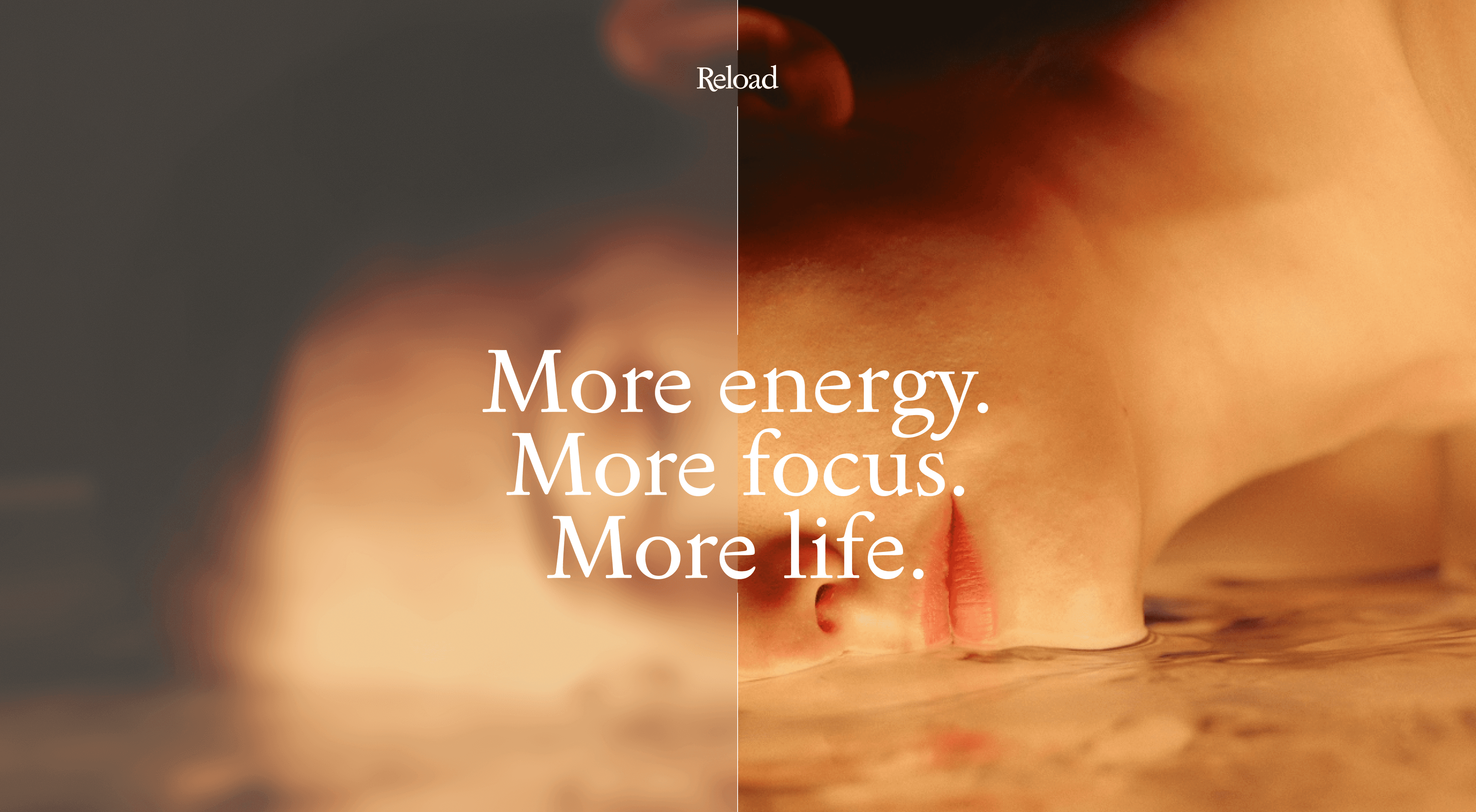
The photography is close and minimal, with a frosted glass effect over parts of the images. It refers to condensation on warm glass, and it makes it possible to use people in the images without them being fully recognisable.
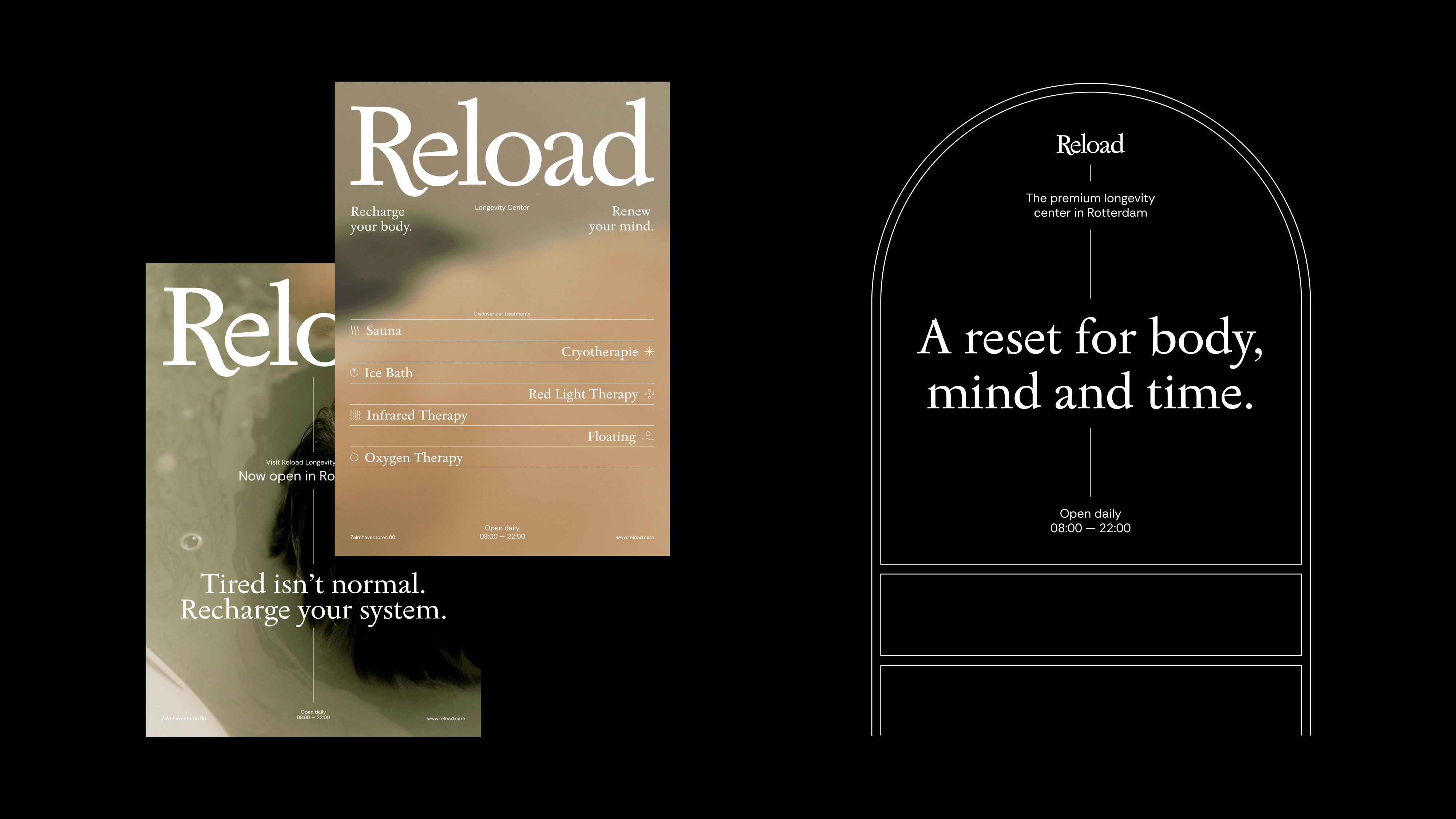
The brandbook covers colour, logo use, photography, tone of voice and applications like social media, posters, signing and digital. Reload wasn't open yet when I made it, so everything had to be ready to use from the start.
Year
2026
Service
Brand identity, brandbook
Client
Reload Longevity Center